Saturday, 4 October 2014

Visual Research

This week I began my research for my chosen area; Urban Influences. In our first tutorial, we were taken to the top of a multi-storey car park to make us think about different perspectives i.e. having a birds eye view over a large area. From this I took a trip around Manchester city center and the Northern Quarter, looking for parts of this urban environment that caught my eye. I particularly liked the older more quirky looking buildings that had a bit of character, but I was also drawn to the more modern simplistic buildings with clean lines. Contrasting with this I also took an interest in looking close up. I was drawn to looking at surfaces and marks in this environment e.g. on drain covers and pavement layouts. I took a number of photos to capture the areas I liked best. Below are couple I found the most inspiring.


I then started looking back at my summer work and picked out parts of it that I liked best. From the 'Present and Reflect' presentations I learnt that my work using ink and water was some of my strongest, and I would like to explore the ways of incorporating these faded qualities to my future work.

Over the summer I researched the artist Cecile Dachary. I found some of her work to be quite similar to mine where I have used water to disturb the the solid ink lines. I particularly liked her series of 9 samples where her work looks quite similar to this; all with a different outcome . This is something I love about working with ink and water - the unpredictability and uncertainty of what the final outcome will be. Although Cecile predominantly works with yarns making small 3D sculptural pieces, this particularly piece of hers I felt linked in well with my own work. Photographed below is an image of the series of 9 samples that I found similar to my work.


Unknown title, Cecile Dachary


So as a starting point I began experimenting with the ways I could create different marks on a page. I worked with glue, crayons, charcoal, ink and water to explore the effects and outcomes these give. I found adding water on top of charcoal gave the drawings/marks a painted quality which I liked. Combining charcoal, water and white ink also gave a really nice effect. These small drawings reminded me of the old black and white photographs I had also included in my summer work. This is where I began looking and focusing on buildings and other building structures.

Monday, 22 September 2014

Present and Reflect

Having returned to Manchester to start second year, our first tutorial had us presenting our summer work to a couple of people in groups. In doing this we pointed out the strengths and weaknesses in each other's work and how we could improve and progress further with our work.

I found this very helpful. Getting feedback from your peers can be quite daunting but I found that I learned a lot about the way I like to work. I also learned about different artists that could help influence me in the future.

During my feedback I discovered that most of my work follows the same pattern. Many pieces of my work show that I like unpredictability. I can get this effect by using water and inks or water colours (photographed below).

water colour and ink pen


black ink pen and water


Throughout my presentation to the rest of the group, the use of hand stitch in my drawing was commented on several times. As this is my specialised area I felt that over the summer it was important to follow this through in my work. With hand stitch, I feel that this emphasises my desire for unpredictability. Photographed below is an example of where I have done this.


flicking watercolour paints and smudging, ..... sticking in a multicoloured vary thread


Wednesday, 10 September 2014

Summer work: Influences

Looking back at the work I produced in the first year, I am trying to now find artists that work in a similar way. I worked a lot with heavy duty D.I.Y materials, building up layers and working into them. I was also using pens and ink, and using water to manipulate my drawings.

Over the summer I came across an artist called Terry Jarrard-Diamond. I especially like her surface design work using ink and paint. These pieces are very similar to work I have done in the past and I have continued to work in a similar way in some of my drawings over the summer break. I like the simple, monochrome colour palette. She works a lot using just lines which I found quite interesting. I like that this composition is simple and so is more technique focused. This is something I have noticed about my more successful pieces in the past.

Terry Jarrard-Diamond

Travelling to the Caribbean every year for as long as I can remember has given me an attraction to bright, vibrant colours in parts of my work. I really like the work by Raul de la Torre. I love his use of vibrant colour and hand stitch. The technique is so simple as a process but is very striking. Below are a couple of images of his pieces.


Monday, 8 September 2014

Summer work: Inspirations

Over the summer I have found inspiration for my work through the places I visited. I spent two weeks in Antigua which I found to have much for me to work from. It was even more inspiring than my visit to Brighton for a couple of days.

Initially, I am always drawn to areas and photographs with bold, bright colours as they attract my attention. The carnival in Antigua was like nothing I had ever experienced before. The streets were filled with locals in costume, dancing to the carnival music playing off the large floats. Each costume was made by hand. I particularly liked this section (photographed below). I love how busy the photo is; filled with vibrant colour and texture.

Carnival - Antigua

I also went on a trip to Brighton towards the end of the summer. I love all the quirky little shops down all the lanes. Again I was attracted to the bright colours here and bought this skewer filled with different marshmallows. All the odds and ends I picked up whilst I was there I found very useful for this summer brief. Particularly the last photograph in this post.

Bought in Brighton

Whilst in Brighton I visited a shop called "Snoopers Paradise". It was filled with everything you could imagine; from old toy cars to vintage milk bottles. Unfortunately I was not allowed to take photos whilst I was in there. However I did purchase a couple of the photographs that were on sale. This was something I found very interesting. These were photographs that had just been discarded or had been removed from a house clearance.I found the idea of this very odd but I spent a while sifting through the boxes filled with these photos. I particularly liked looking at the different landscapes. So I bought a couple to use to inspire me with my work.

Old photo bought from a hoarders shop in Brighton

Saturday, 10 May 2014

Final Piece

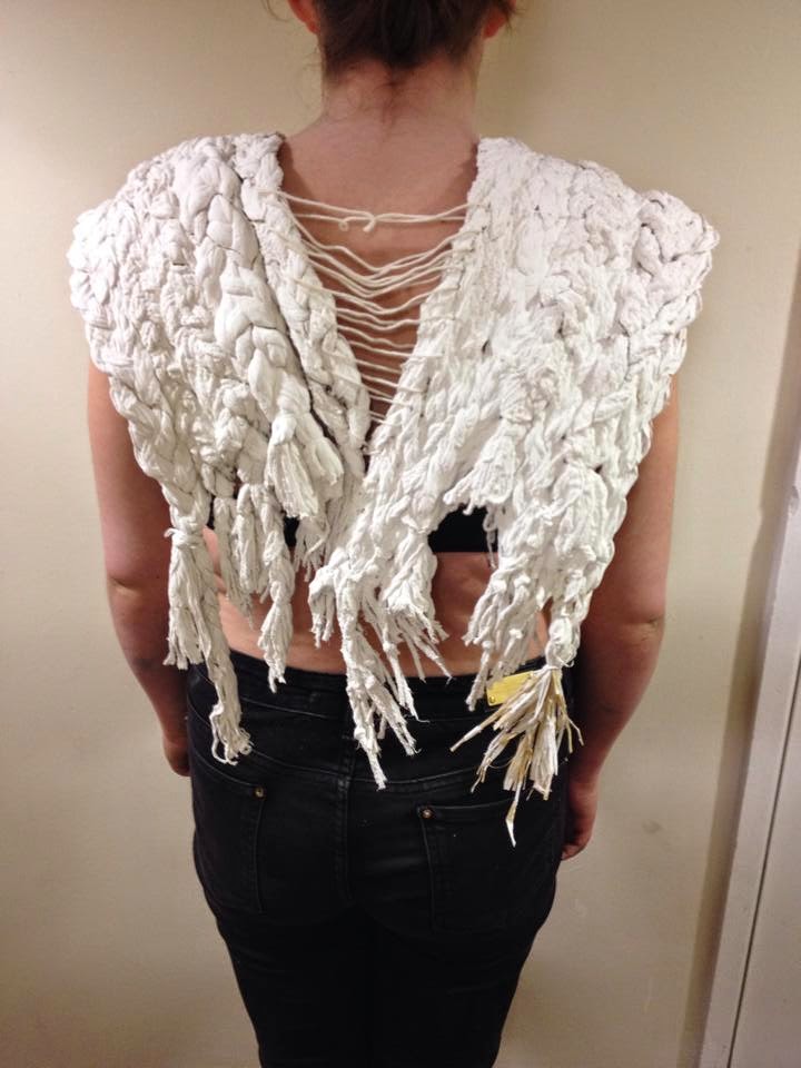
Using the images in my previous post, which show various shoulder padded clothing items by different designers, I created my own pair of shoulder pads. I used the ideas from my sampling and my sketchbook work to influence my this piece.

This final week was leading up to the production of a collection of samples or one final piece that is based around accessory design; using stitch, weave or both. However, I wanted to be more hands on with the work I was to produce at the end as I felt the machines and looms were limiting my samples. So I used some hand stitches and knots to hold the yarns and materials into place; and I felt this made the final outcome more successful.

Below shows a couple of photographs of my piece from the front and the back.


front view

       back view          

My final piece was created by developing my braided sample. I used longer lengths of thicker yarns and materials, which I then painted with only emulsion paint to make them more supple and easier to manipulate. I made two of these identical to one another, one for each shoulder pad. I then inserted wire into sections of each shoulder pad to give each a stronger structure. Finally I connected the pads at the back by hand stitching (ladder stitch) one edge to the other to hold them together but leaving the back open.

     close up

 side view 1

side view 2


Sunday, 4 May 2014

Collars and Shoulder Pads

In this last week we are to look back through all the work we have produced over the 4 weeks and focus our attention on either weave, stitch or collaborate with both.

After reading back through our Unit X brief, I discovered it states that 'the emphasis will be placed on designing for accessories'. For example, cuffs, collars or shoulder pads. I have therefore been researching many varieties of these, a few of which can be seen below.


I really liked this idea above of over sized collar, and I feel it could work well as an accessory piece with my samples incorporated. However, I much prefer the idea of shoulder pads that could then be developed further, as they would work more successfully with my sampling. I have decided to use the ideas from my samples in my previous post. The cement and emulsion will give them the stiff quality that is unique to shoulder pads.

Below shows a few ideas I will work with to inspire me for my final piece.


Thursday, 1 May 2014

Cement and Emulsion

Following my crit after Easter it came to my attention that some of my samples were too flimsy and small. My tutor pointed out to me that my work was much stronger when I made samples on a larger scale and didn't hold back with bold ideas. Therefore I proceeded to think of ways to enhance this quality. I turned to using heavy DIY materials such as cement and emulsion paint to see how this would make a difference to my work. I took a trip to a local DIY store and bought both of these items as well as some tough fabric to work with. 

Incorporating an idea from one of my previous samples where I braided lengths of different textured yarns and secured them with a couple of stitches, I created another, almost identical to this but on a larger scale (below), and proceeded to coat it in cement and then emulsion paint to give it rigidity and a neutral colour. I felt that in doing this, it gave a stiff quality that reminded me of some of my paper samples.


By this point I had removed my colour palette completely from sampling as I felt the pieces I was producing worked better neutral; being able to focus more on the texture than the colour. Below is the outcome of the cement and emulsion paint applied to the braids in the above photo.


I discovered that the more emulsion I applied, the stiffer the sample became and the colour became more of a block white than being patchy. I like this quality as when I tried to manipulate it by bending, cracks were formed and small pieces of paint and cement came away which added more texture.

This process is one I will be taking further to a final idea as I feel it has been a success; incorporating the progression work from my sketchbook to create a 'final piece' or collection of 'final samples'.